Moodboards
Research & exploration
direction studies

Visual Research & Direction Studies
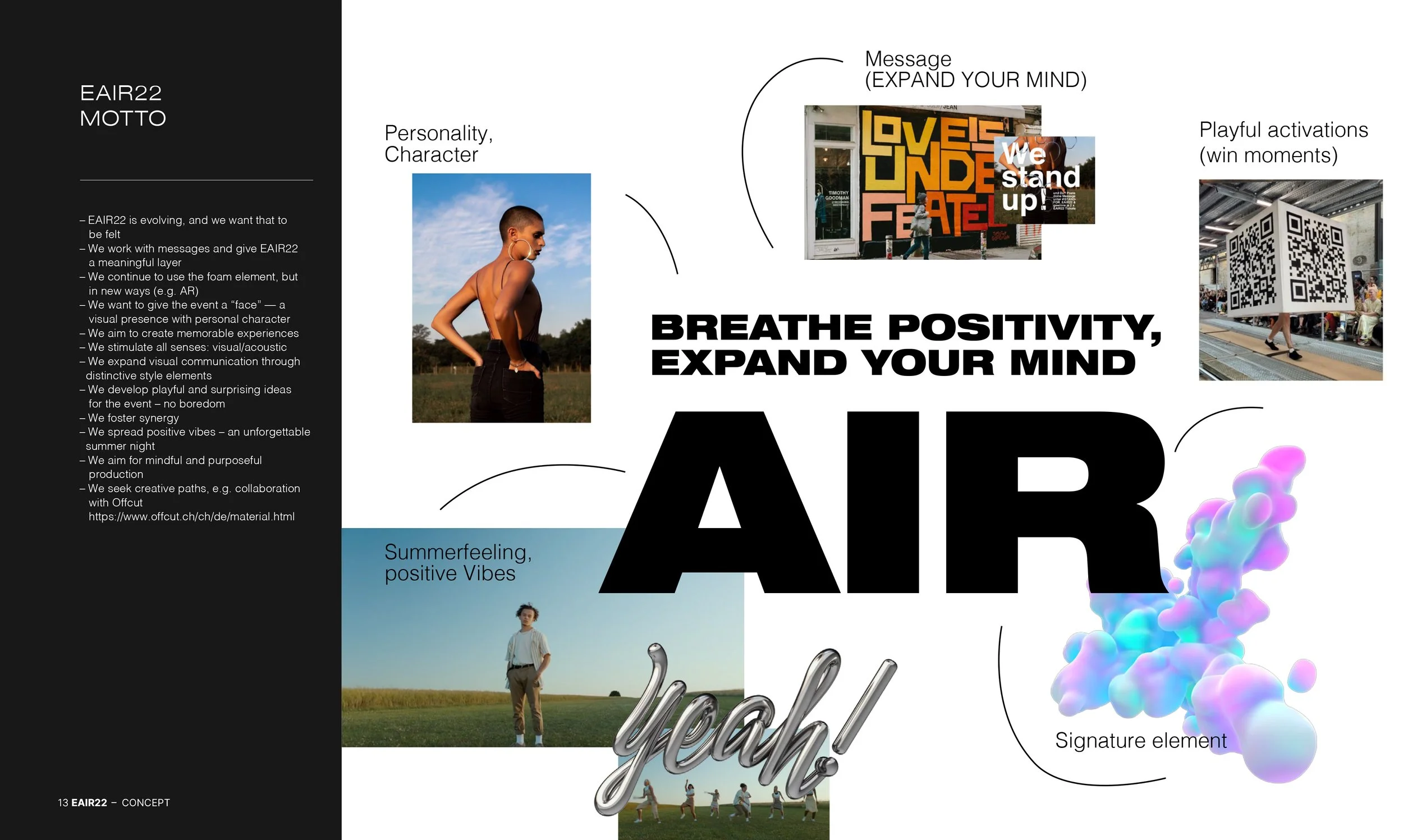
Some of the best ideas live in the shadows — raw, unpolished, full of possibility. This space brings together early sparks: multiple moodboards, style directions, and visual explorations before anything is set in stone.
Developed across different concept phases, each board captures a distinct line of thought — from emotional tone to strategic identity. Together, they form a playground for experimenting freely, shaping aesthetics, and exploring potential narratives. All imagery is curated from public platforms (mainly Pinterest) and used for non-commercial, inspirational purposes only.
– conceptual thinking
– visual exploration
– direction studies
– mood & tone testing
– experimentation
Multiple concepts.
Scroll to explore each direction.
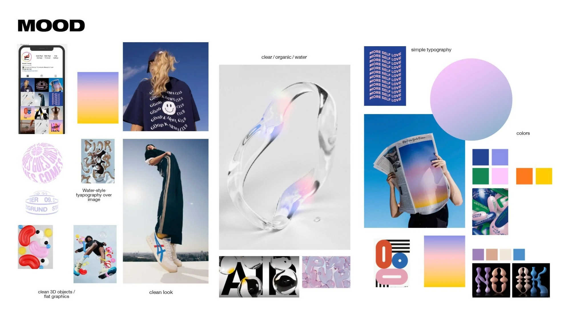
Moodboard Direction: Unpolished Sparks, a space to explore aesthetic intuition – balancing clear surfaces with playful forms. Built to shape mood, test atmosphere, and discover visual language. All imagery is non-commercial and curated from public sources for directional research.

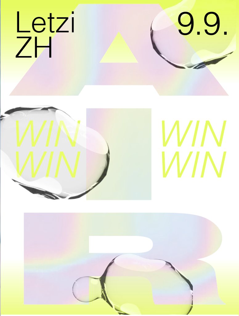
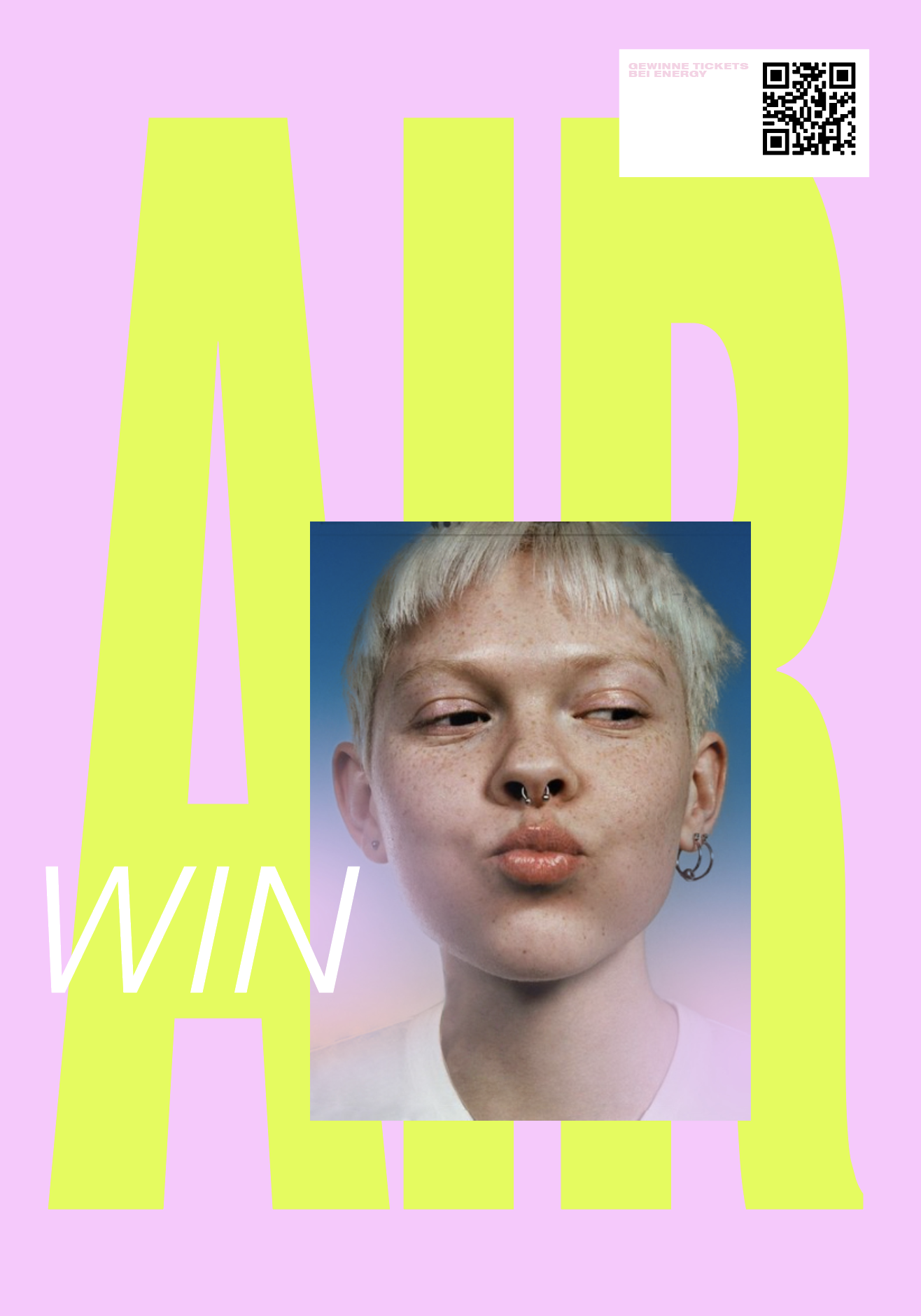
Typographic Trends: Exploring forms, textures and attitudes in letter design – from bubbly and soft to chrome and crystal clear.
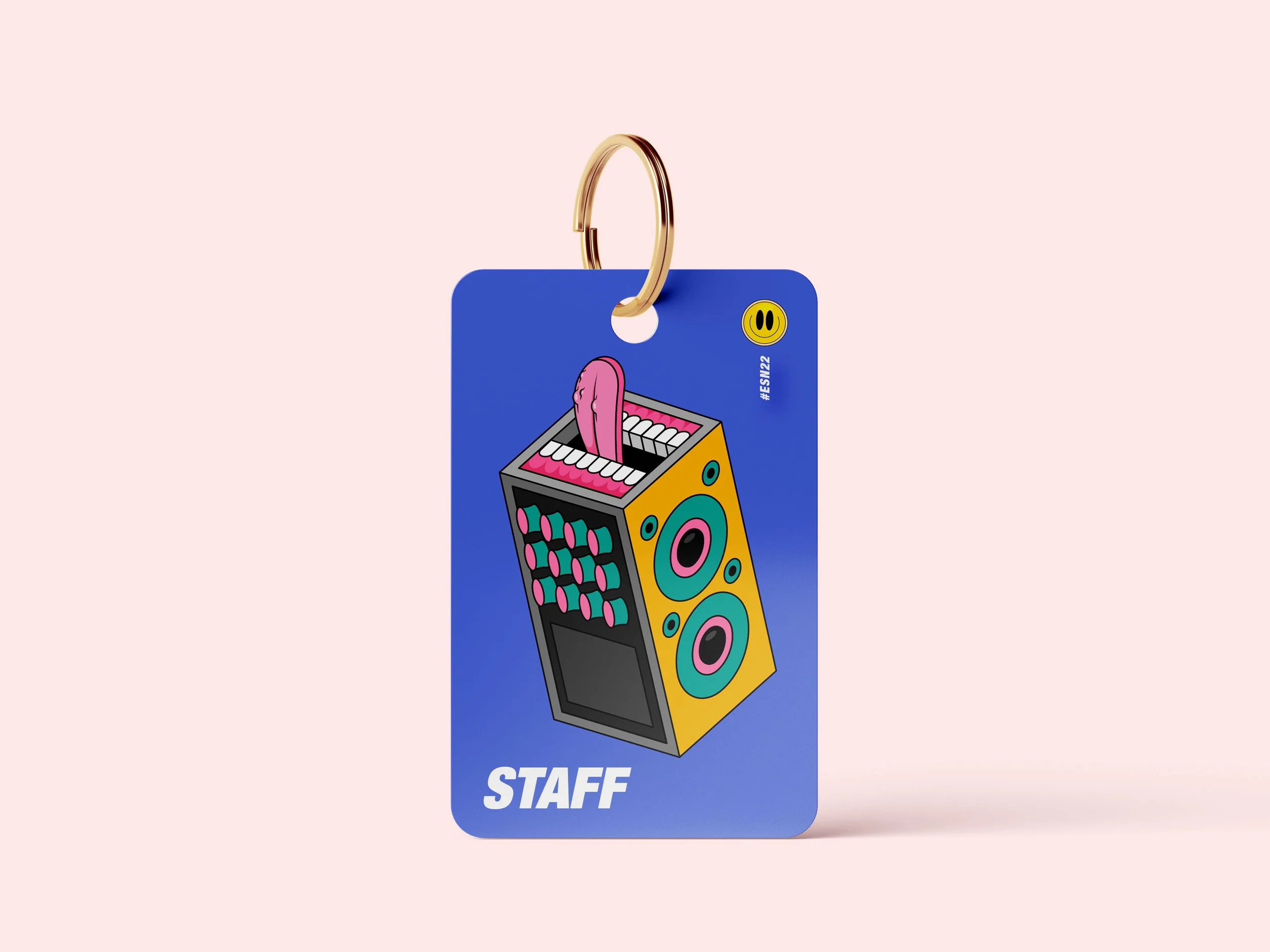
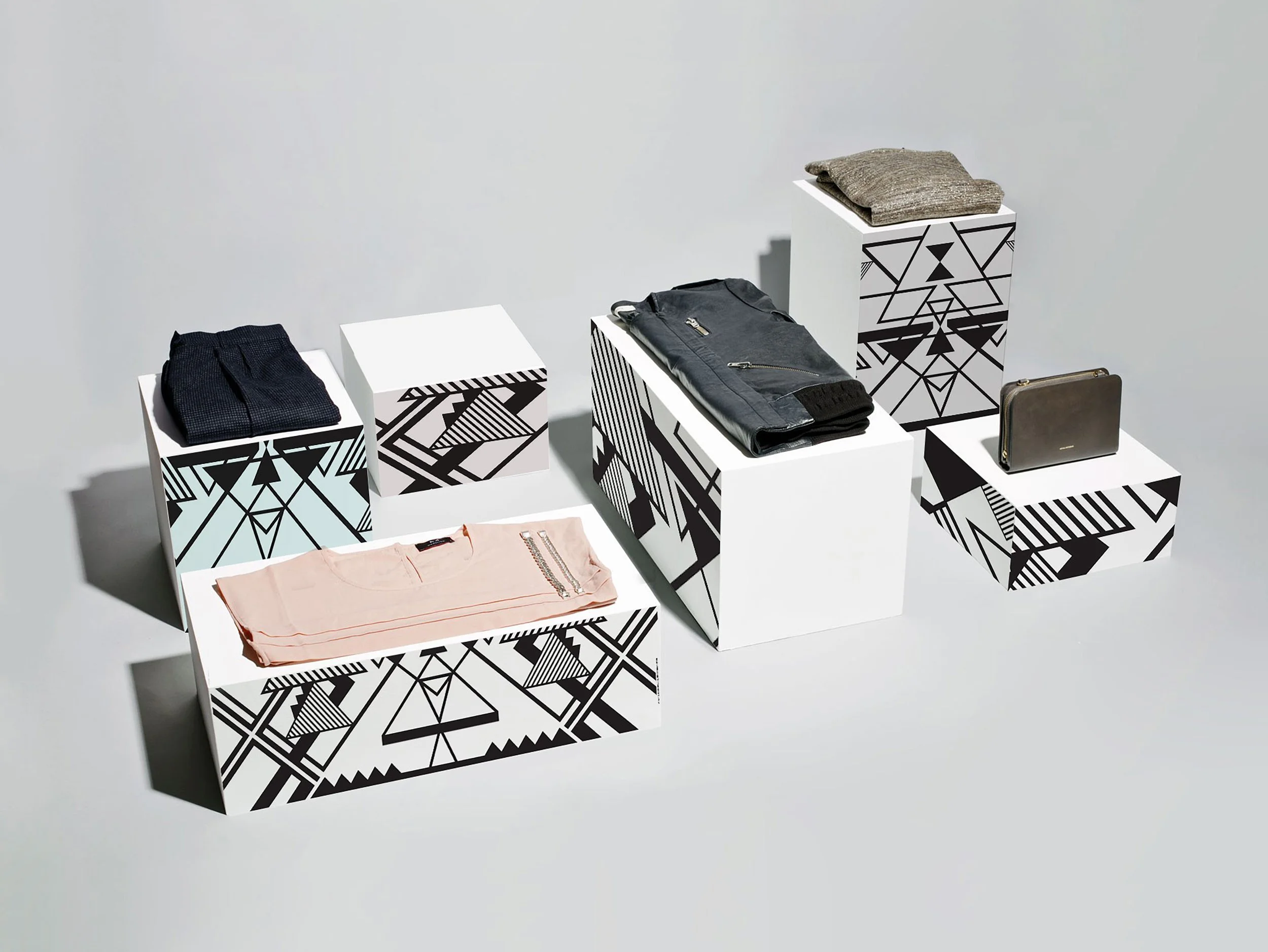
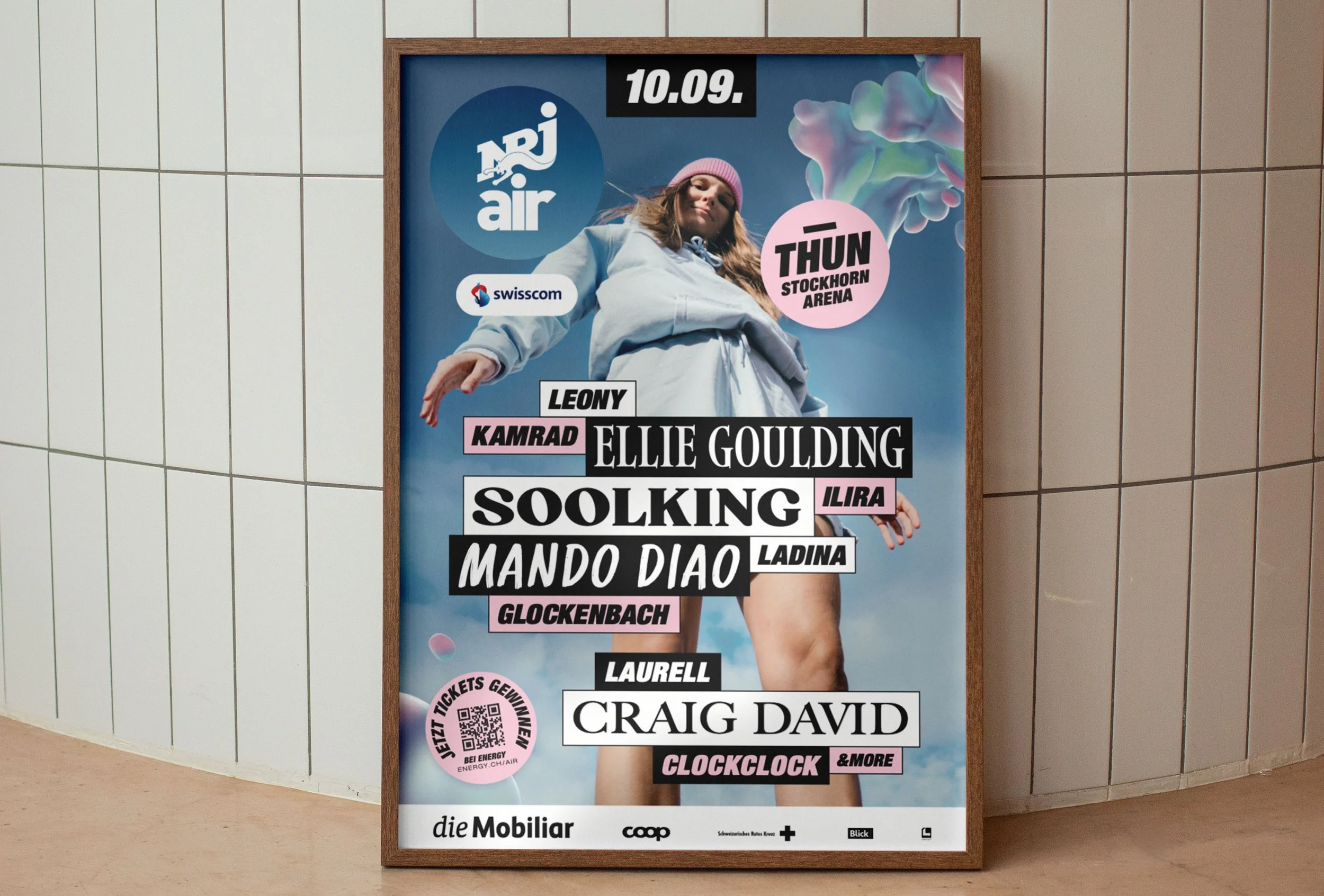
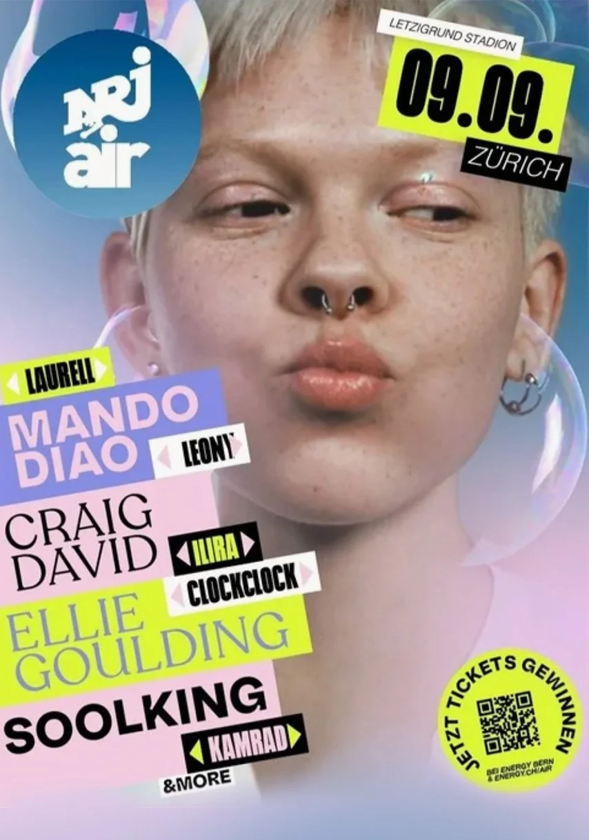
Design Drafts: Concept development through visual mood studies. Layouts were created to explore tone and context. Some images used for study purposes (Pinterest); layout, color, type and concept by me.
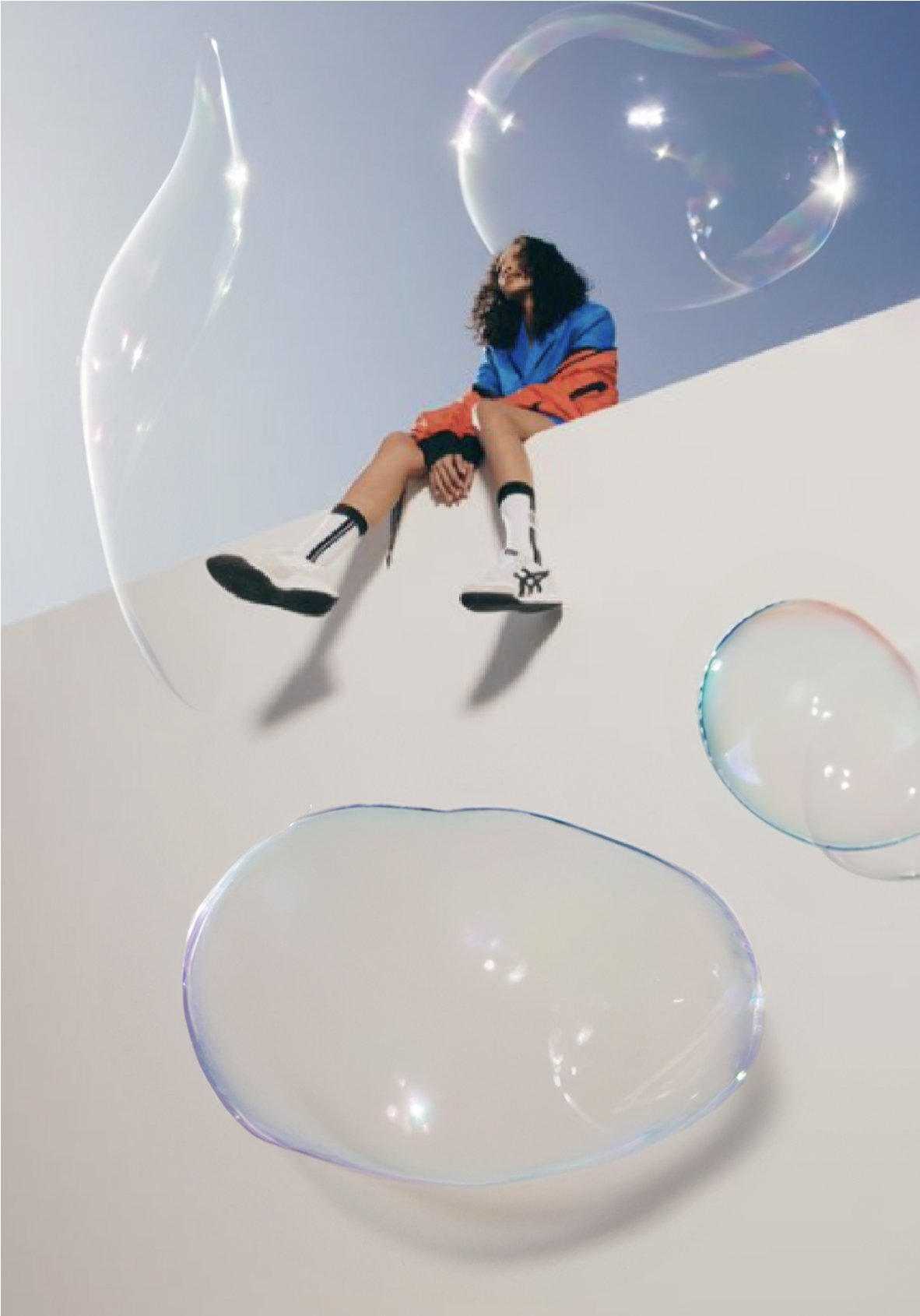


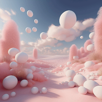
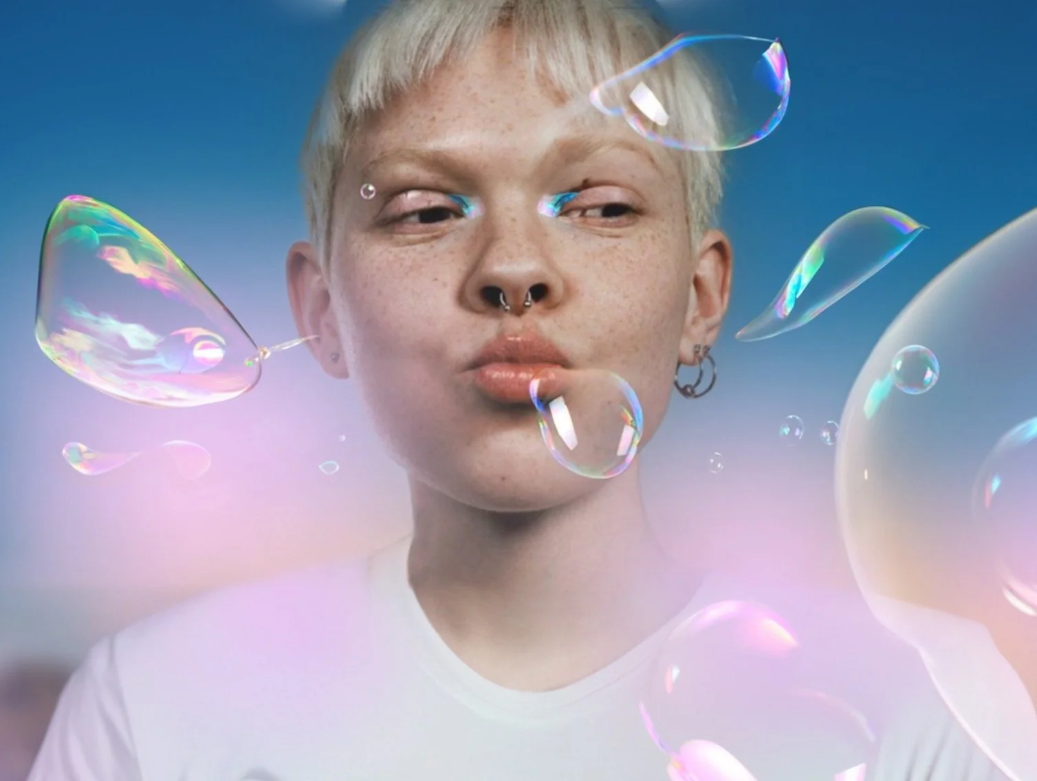
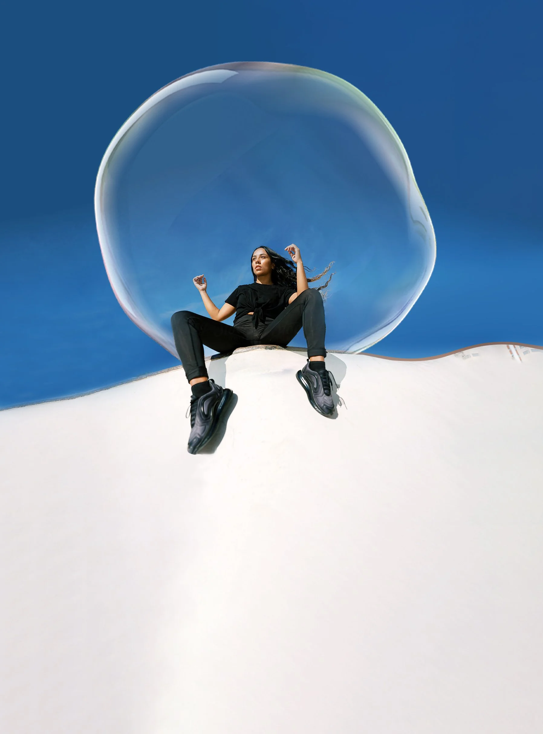
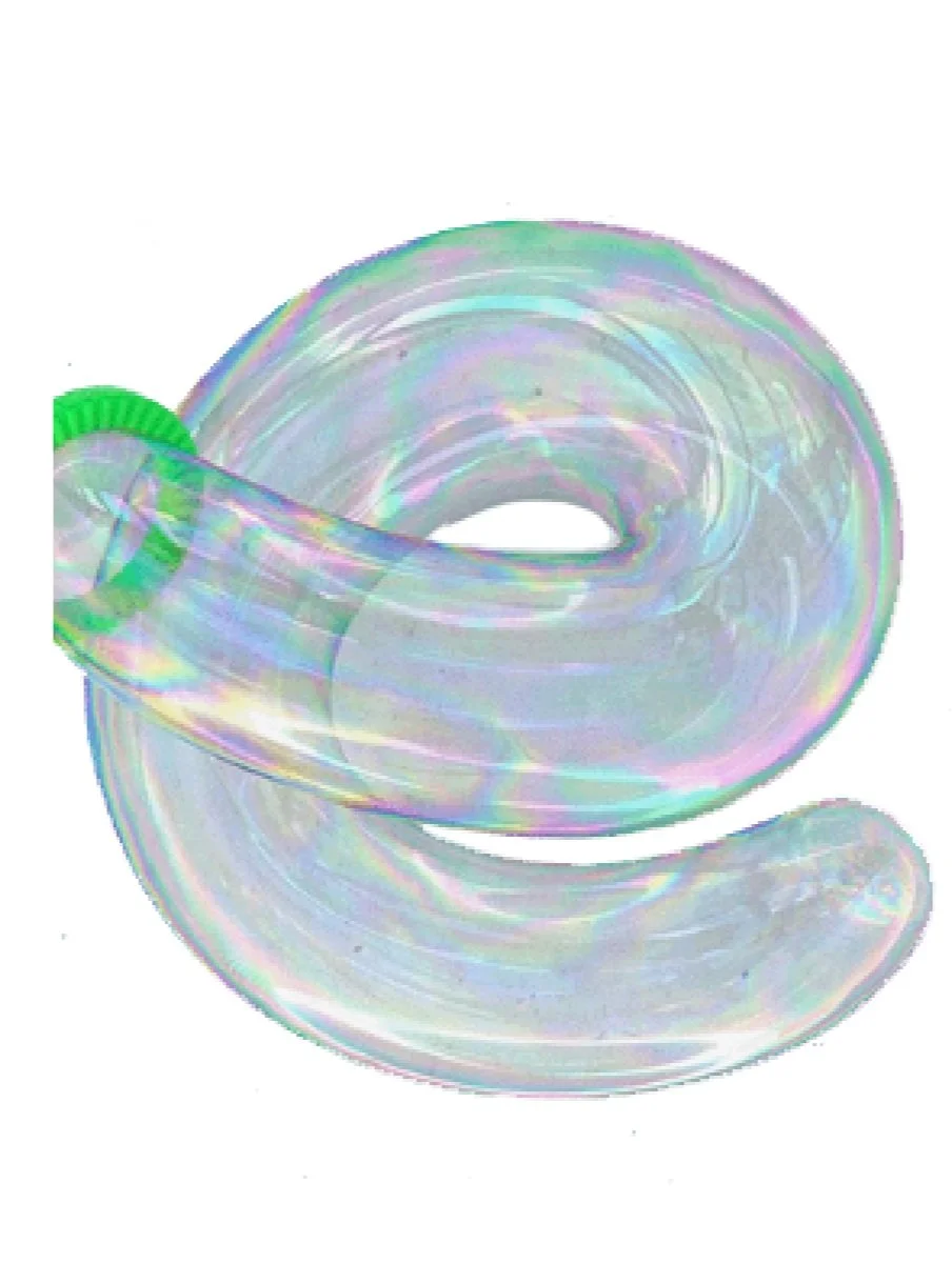
Visual Study: A series of compositional experiments combining found imagery (Pinterest/Google) with AI-generated soap bubbles. The aim was to capture movement and visual lightness through oversized bubbles and dynamic figures. For non-commercial, inspirational use only.

Visual Research: This first phase was all about getting a feel for the right visual language – bold, playful, a little loud. I collected references, explored different directions and looked for artists whose energy matched the project. Images used for inspiration only, non-commercial.
From Mood to Message
A Concept Study in Style & Emotion

This project came out of an early concept phase – a space to think freely, explore moods, and shape ideas through visual language. It wasn’t about execution yet, but about asking: What kind of world do we want to create? What could it feel like?
I worked with type, textures, and imagery to build a tone that felt bold, soft, and human. Some elements like the T-shirt mockups were created as part of the visual exploration and were not developed further at this stage. The work reflects how I approach creative direction: deeply, emotionally, and with a clear sense of visual storytelling.
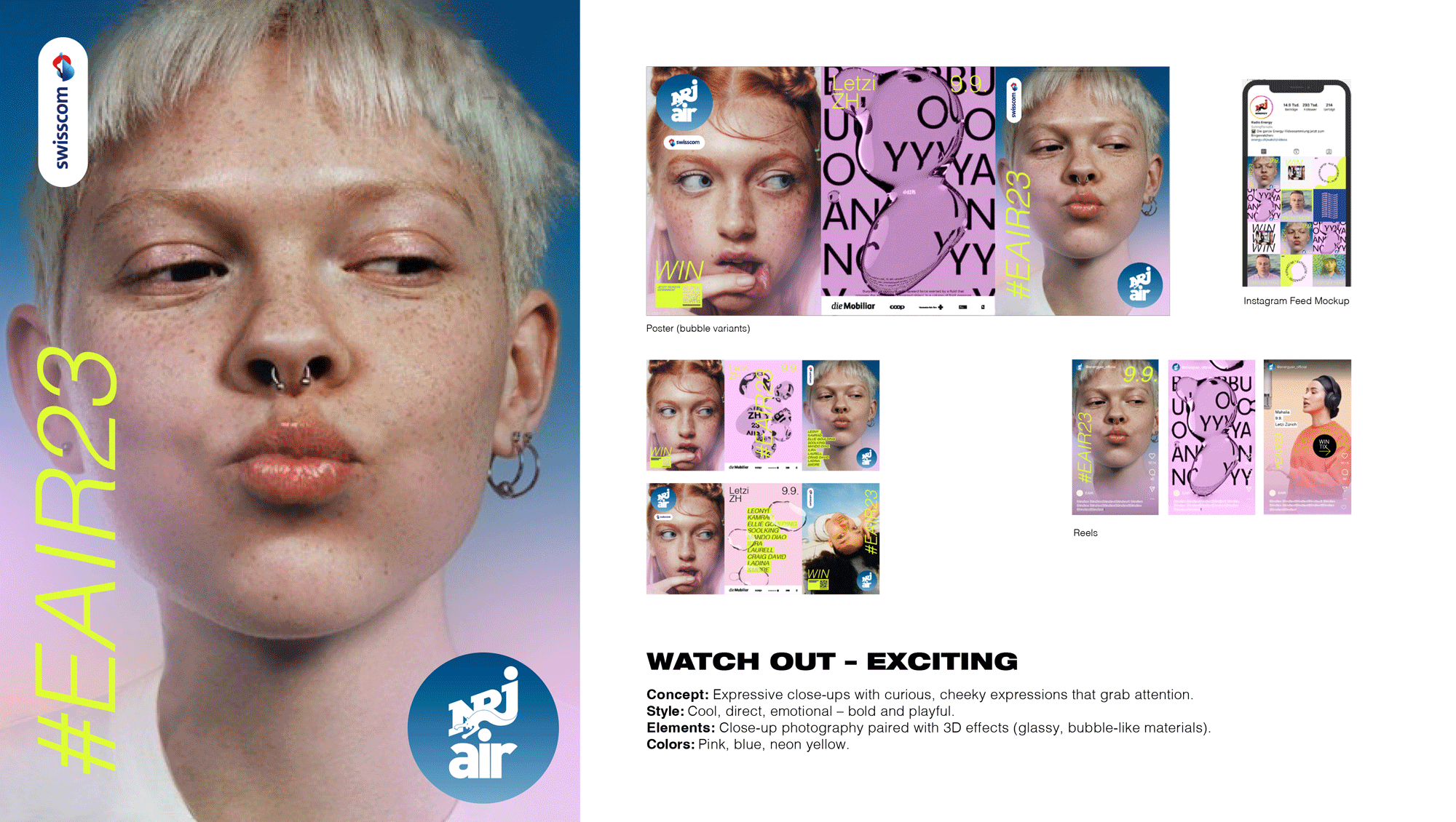
Moodboard & concept keywords – Early explorations of tone, energy and messaging. Editorial visual direction – Expressive, fluid and sunlit – aiming for emotional connection.

Typo Experiment – A test with chromatic 3D type to define mood and style direction.
Statement draft – Framing the project purpose and audience connection. into physical formats and community touchpoints.

Merchandise mockups – Designed to test how visual elements could extend into physical formats and community touchpoints.
Visual Exploration – Testing Directions & Mood
Explorative studies developed to test visual tone, content rhythm, and brand expression across digital formats. Each direction reflects a different emotional and stylistic approach.
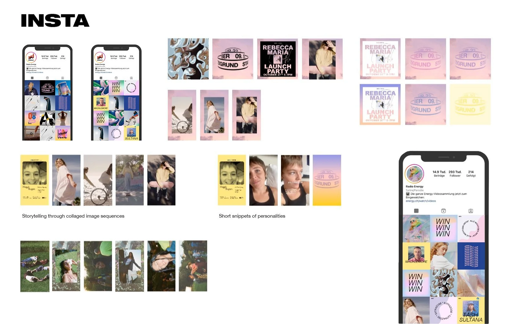
Instagram Grids – Exploring visual rhythm and storytelling pattern
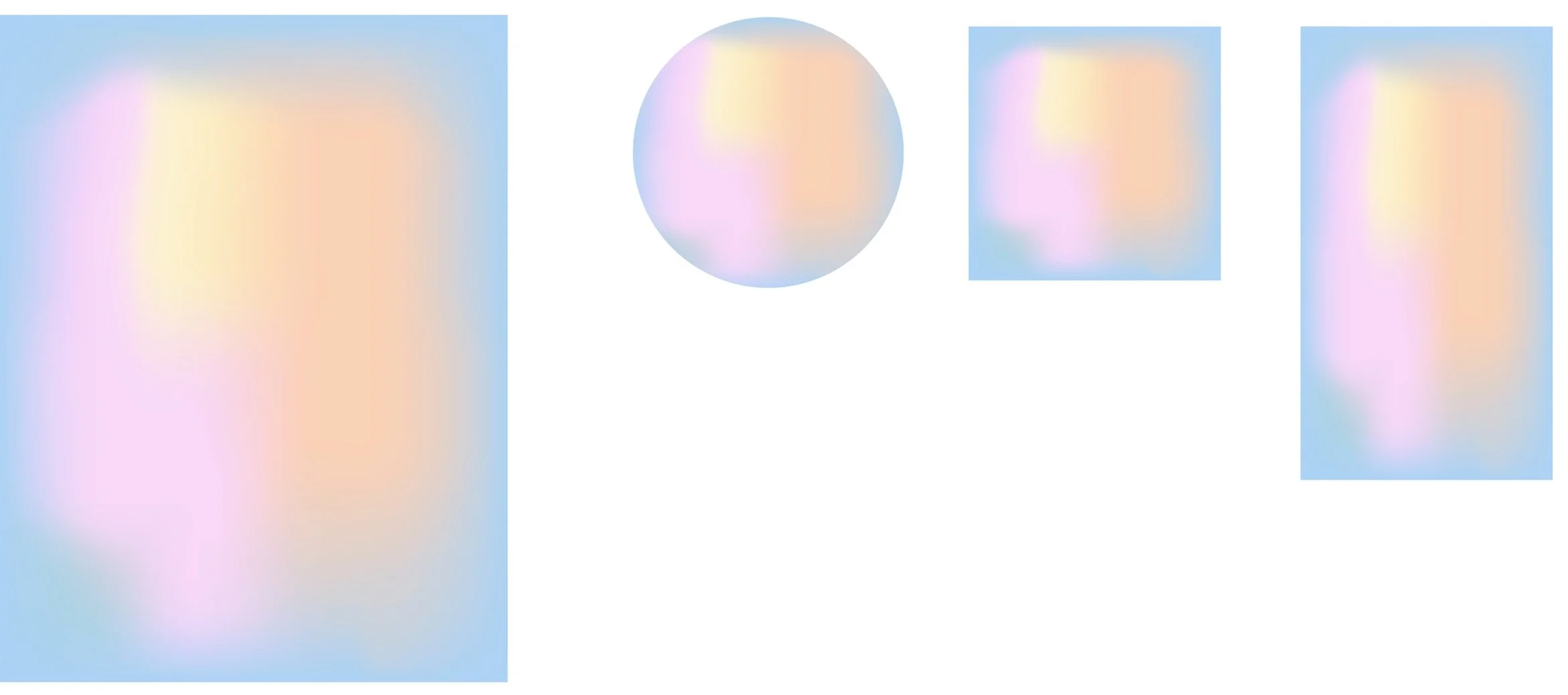

Soft Gradients – Building mood through light and color flow
Compositions & Textures – Oversized bubbles and fluid forms in motion
Typography Experiments – Playing with layout, contrast and hierarchy