Design Services
Clear. Personal. Visually strong.
I create thoughtful brand identities with a calm aesthetic and a deep feeling for typography, imagery, and atmosphere.
Build → Explore → Define → Commit
Projects can start at different stages — depending on clarity, timing and scope. The following packages support projects at different stages — from early exploration to committed visual identities.
→ Build
Package 01
Squarespace Website
Visual Website Sprint
A visually focused Squarespace website, built efficiently and clearly — based on a defined visual direction. Designed for brands that value aesthetics, clarity and a smooth process over technical complexity.
Built for speed and visual consistency — not for complex brand systems.
Ideal for
– Design-led small brands & personal projects
– Cafés, studios & lifestyle brands
– Designers, creatives & solo founders
Includes
– Visual concept & moodboard
– Color & image world
– Typography setup
– Squarespace build (template-based)
– Customized homepage & selected inner pages
– Minimal, trendy or artistic style
– Basic SEO (titles, descriptions, structure)
-
2–3 presentations
1. Visual direction & structure
2. Design implementation
3. Final refinement & launch preparation -
2–4 weeks (depending on scope)
-
CHF 2’000 – 3’500
Light logo usage or adaptation can be included. Full logo development is quoted separately.
→ Build → Explore
Already have a direction — or need one first?
If things still feel open, start with a focused visual exploration.
01
Package
→ Explore
Package 02
Moodboard Sprint,
Visual Research & Direction
A short, focused sprint to explore mood, tone, and early visual direction. For projects at the very beginning — when everything feels possible and still undefined.
Built for speed and visual consistency — not for complex brand systems.
Ideal for
– A first idea that needs visual grounding
– Exploring potential before going further
– Small brands, personal or experimental projects
– First presentations or early-stage concepts
Includes
– 1–2 curated moodboards
– Color mood & image direction
– Typography feel
– Short written explanation
-
1 presentation
1 refinement round -
1 week
-
CHF 500 – 800
→ Explore → Define
When exploration turns into clarity, a defined visual direction helps teams align and move forward with confidence.
→ Define
Package 03
Focused Visual Direction
Concept & Direction Study
A focused direction phase to define a brand’s visual tone and voice — clear in intention, grounded in conceptual depth, without full execution. Further design work can be supported on request, depending on scope — otherwise intended to guide internal brand or design teams, or external partners.
Ideal for
– Brands seeking a clear visual direction
– Exploratory or early-stage projects
– Visual repositioning
– Cultural or experimental formats
– Temporary formats such as pop-ups or launches
Includes
– Visual direction concept & decision framework
– 1–2 direction routes (explored and compared)
– Moodboard(s) with curated references
– Color mood & image direction
– Typography direction (type feel / pairings)
– Key principles for consistent execution (what to keep / avoid)
– Short written rationale to guide internal teams or partners
-
2 presentations:
1. Direction & exploration
2. Refined visual direction -
2–3 weeks (depending on scope)
-
CHF 2’000 – 3’000 (project-based)
→ Define → Commit
For brands ready to decide, a focused identity sprint translates direction into a cohesive, usable foundation.
04
Package
→ Commit
Package 04
Focused Visual Identity Sprint
A compact identity sprint for brands that need clear visual decisions and a cohesive, ready-to-use foundation — so others can confidently build on it. Further design work can be supported on request, depending on scope —
otherwise intended as a finished visual foundation for consistent execution by internal teams or external partners.
Logo development scope is defined per project, depending on brand scale, complexity and intended usage (local to international).
Ideal for
– Brands preparing for launch or repositioning
– Growing businesses needing a sharper visual language
– Projects that require commitment and long-term consistency
Includes
– Visual identity concept
– Design principles & visual logic
– Moodboards & visual system
– Logo design or logo refinement (digital-first)
– Simple logo variants
– Simple logo variants
– Selected key visuals or mockups
-
3 presentations
1. Direction & positioning
2. Visual system & logo development
3. Final identity refinement -
3–4 weeks
-
CHF 3’500 – 5’000
Logo Add-On
Extension & Usage
For projects that require deeper refinement or real-world application beyond the core identity.
Includes
– Logo precision & refinement
– Usage examples (web, social, basic applications)
– Simple usage rules
– File preparation & export
Timeline
1–2 weeks (depending on scope)
Investment
CHF 1’500+ (project-based)
-
1–2 weeks (depending on scope)
-
CHF 1’500+ (project-based)
01 Website → bauen
02 Moodboard → fühlen
03 Visual Direction → entscheiden
04 Identity → festlegen
Services
Build → Explore → Define → Commit
Projects can start at different stages — depending on clarity, timing and scope.
Clear. Personal. Visually strong.
I create thoughtful brand identities with a calm aesthetic and a deep feeling for typography, imagery, and atmosphere.
– x
– x
– x
– x
– x
Multiple concepts.
Scroll to explore each direction.
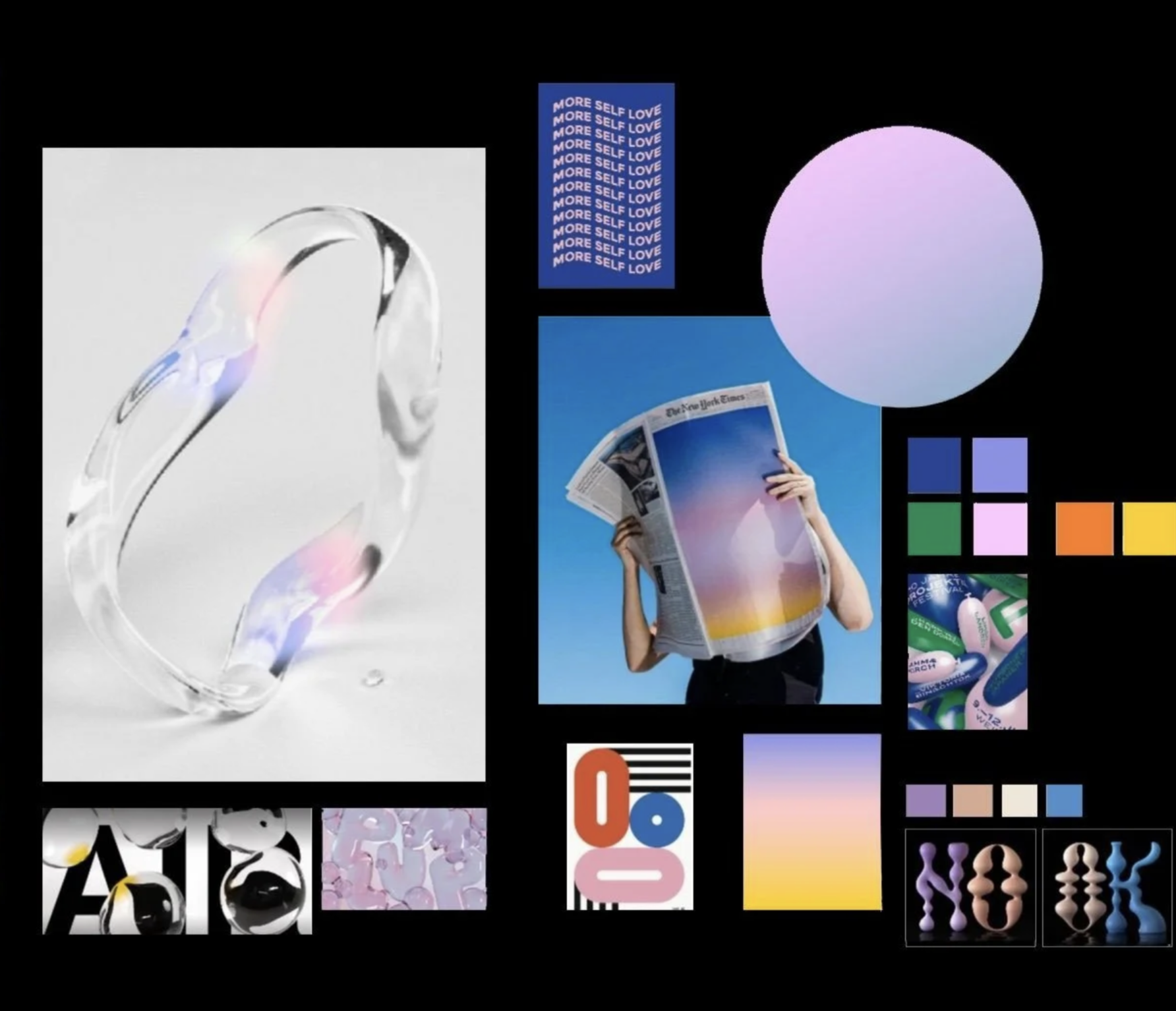
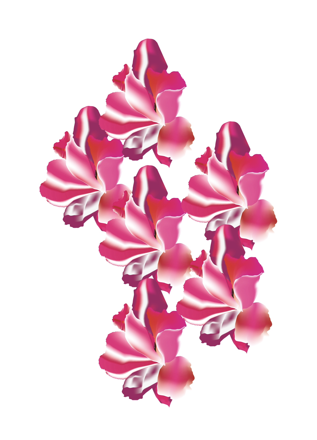
Moodboard Direction: Unpolished Sparks, a space to explore aesthetic intuition – balancing clear surfaces with playful forms. Built to shape mood, test atmosphere, and discover visual language. All imagery is non-commercial and curated from public sources for directional research.

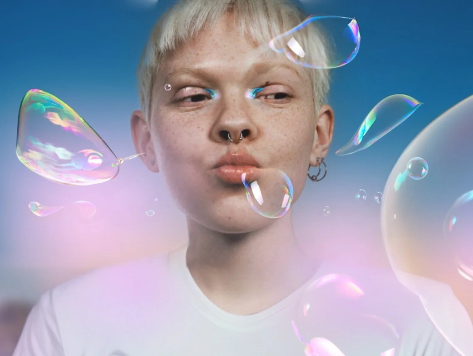
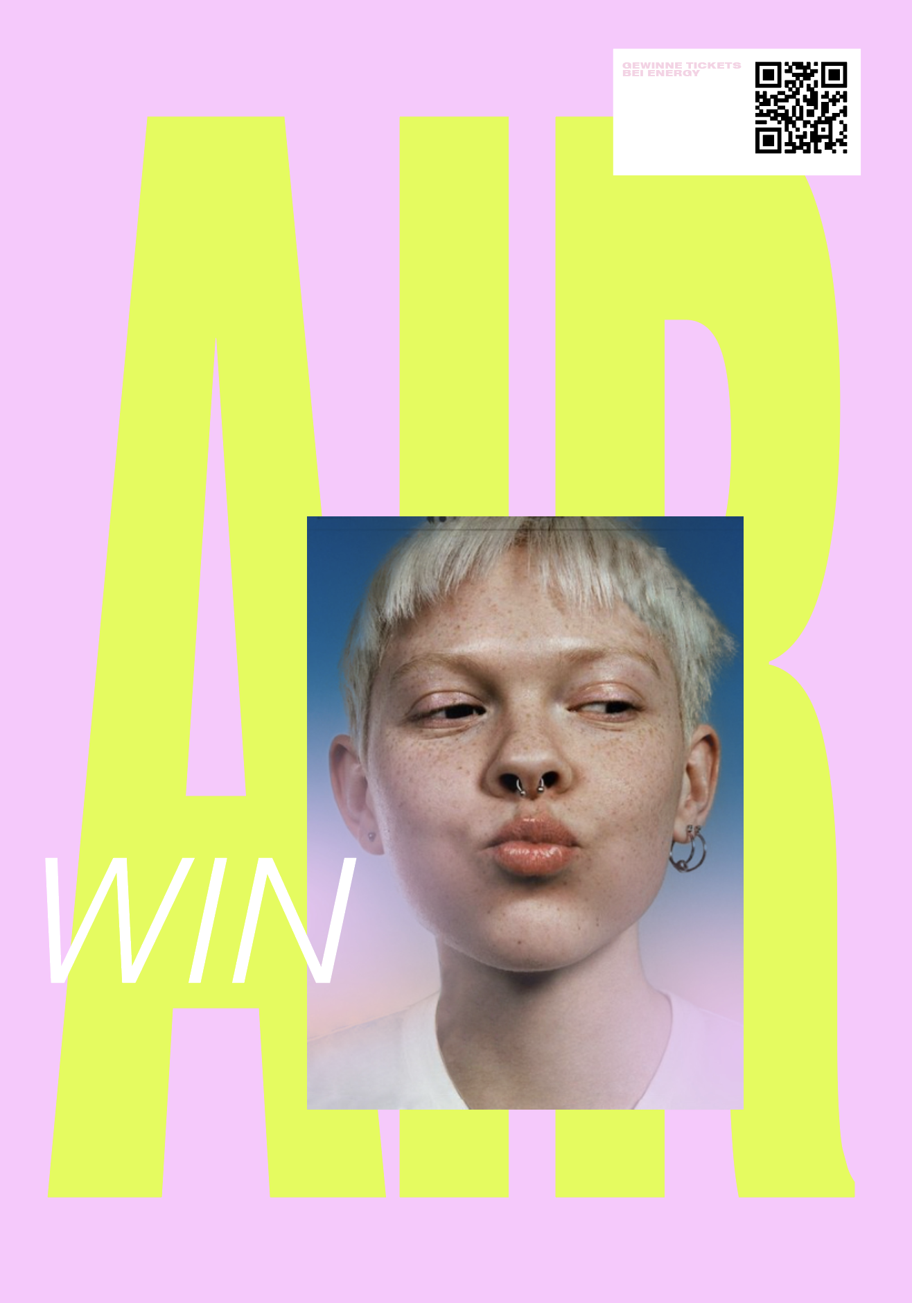
Typographic Trends: Exploring forms, textures and attitudes in letter design – from bubbly and soft to chrome and crystal clear.
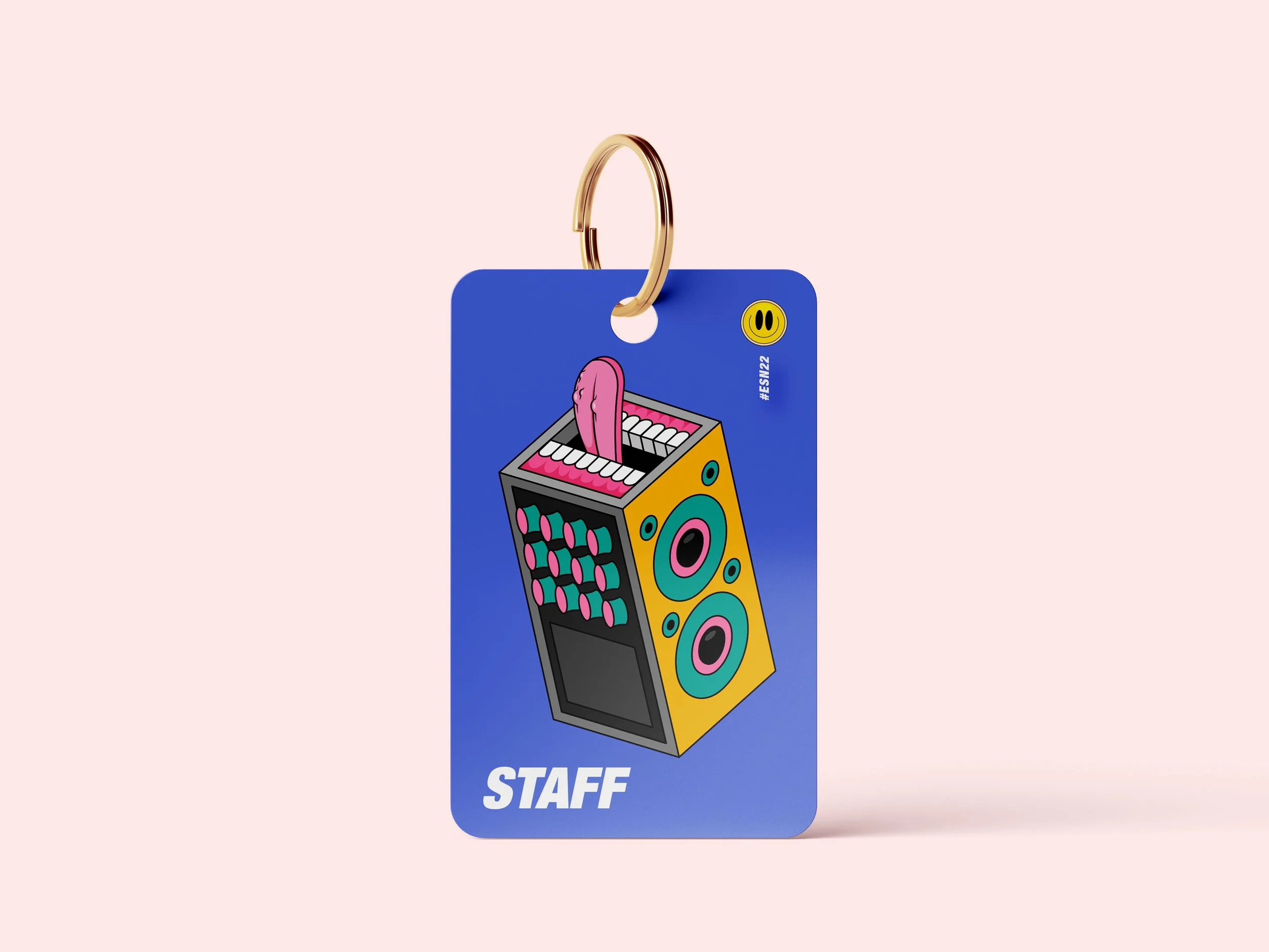
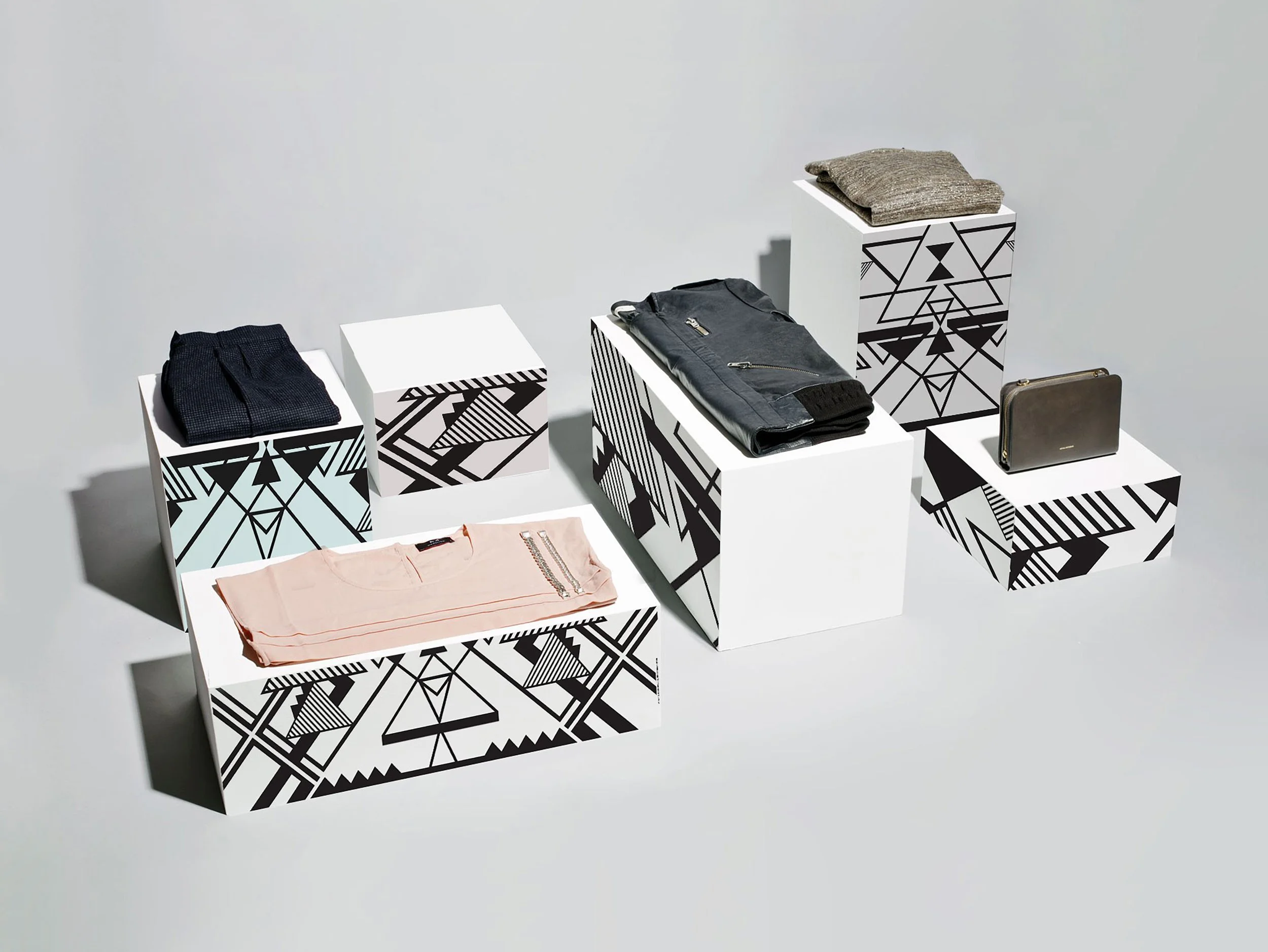
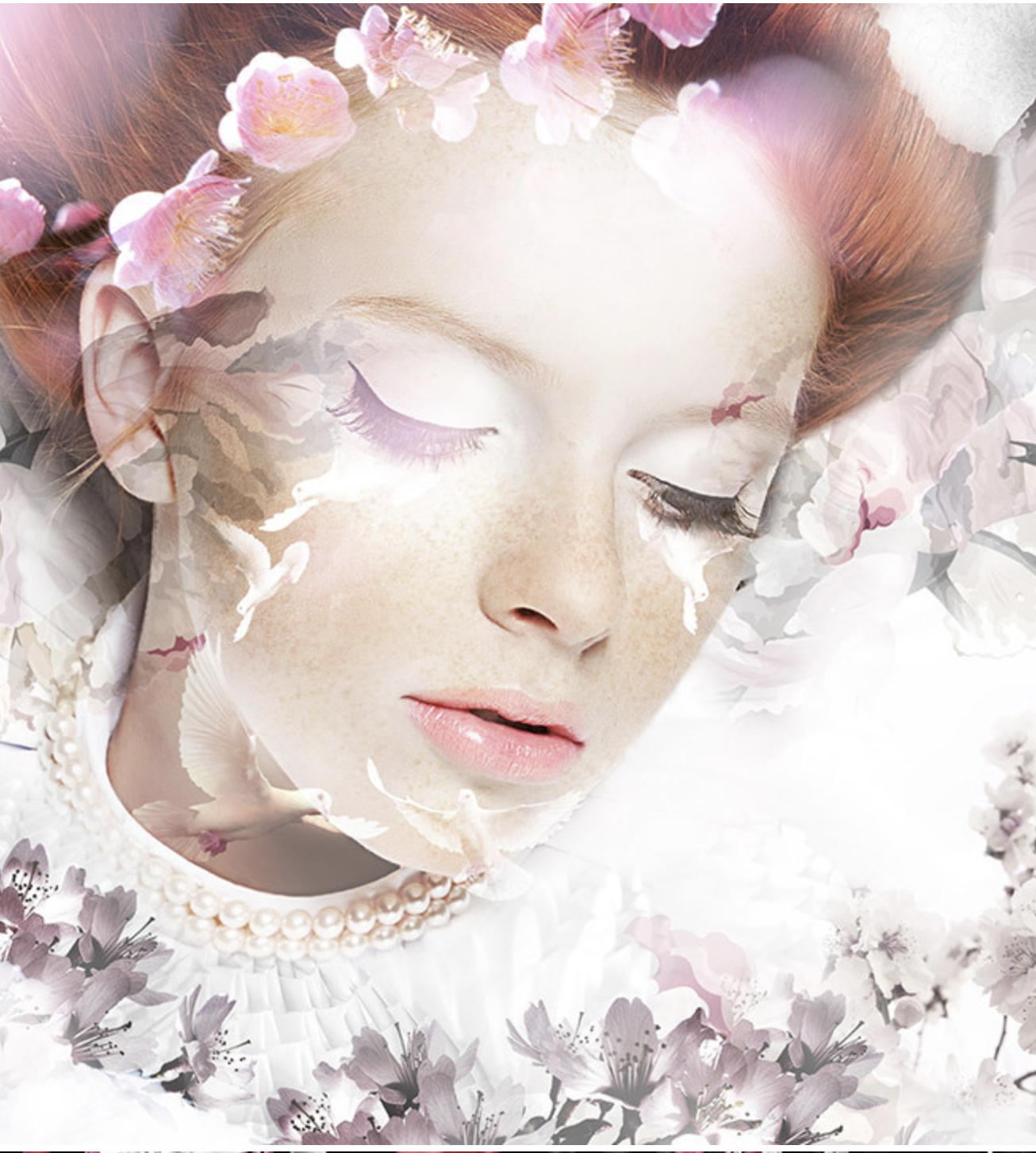
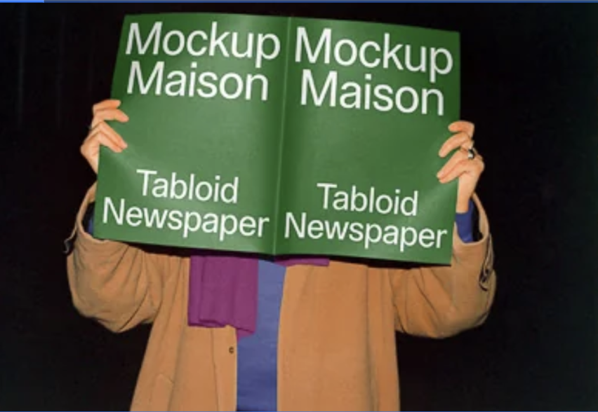
Design Drafts: Concept development through visual mood studies. Layouts were created to explore tone and context. Some images used for study purposes (Pinterest); layout, color, type and concept by me.
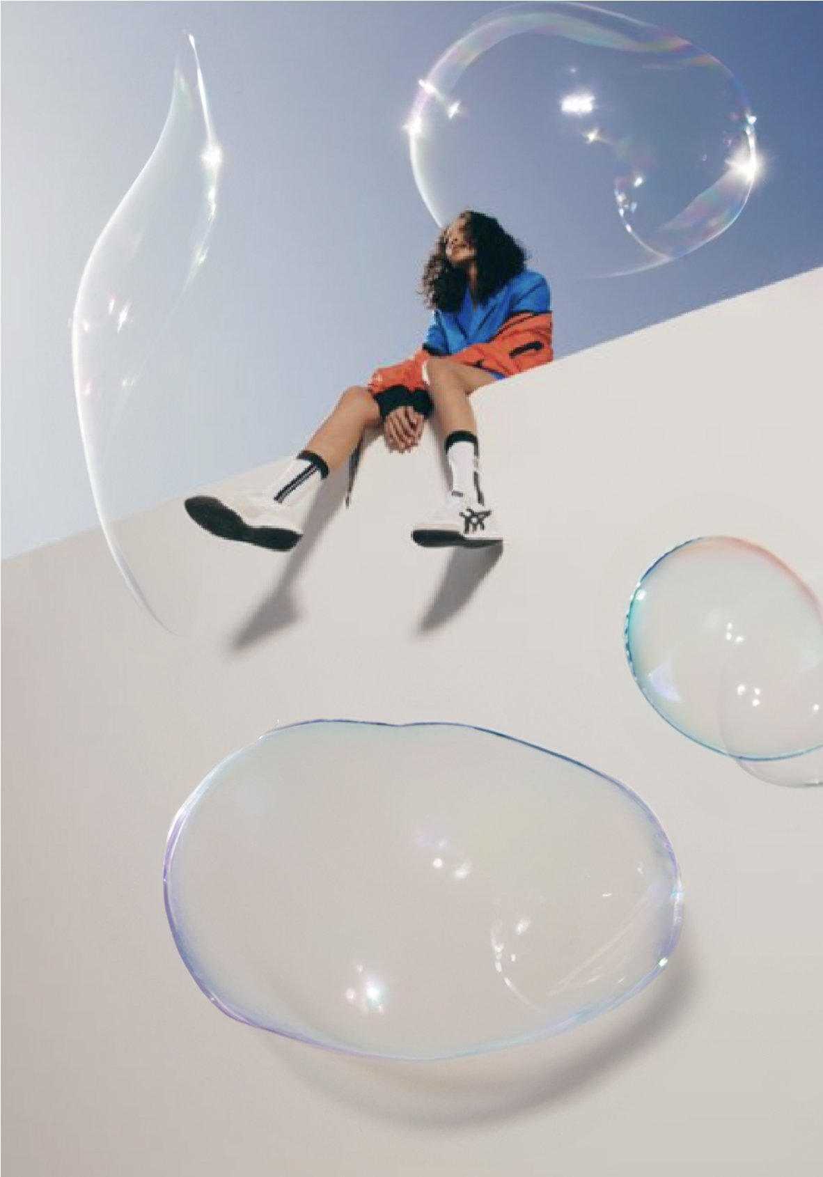


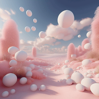
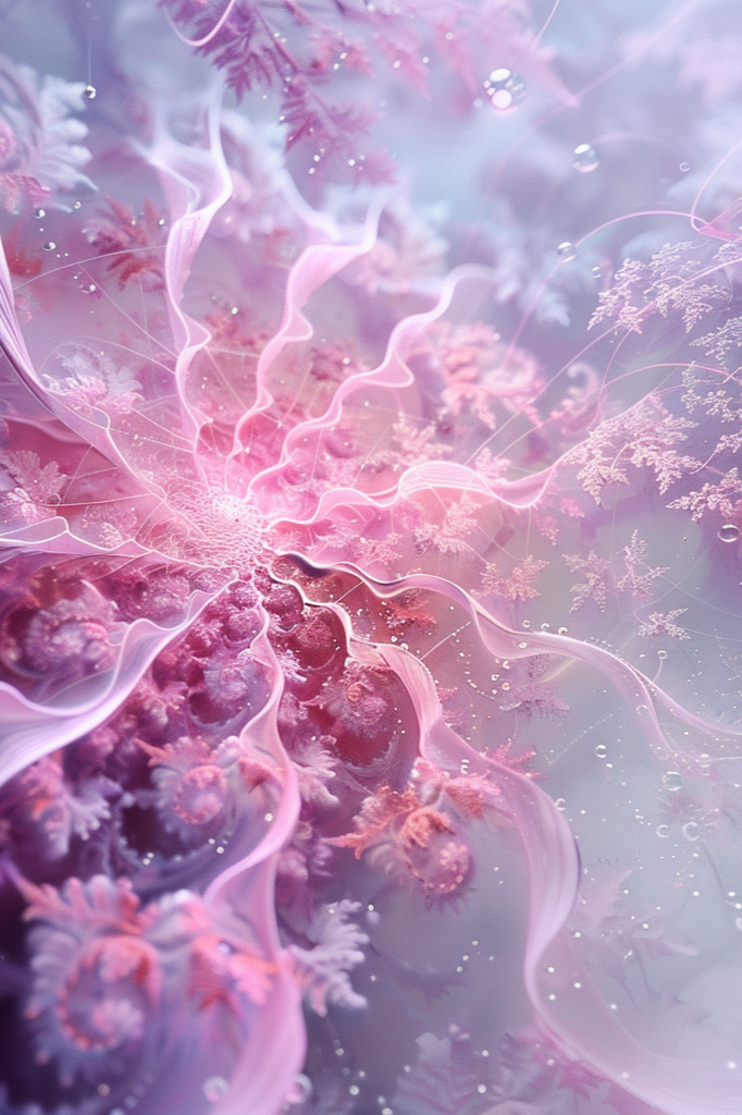
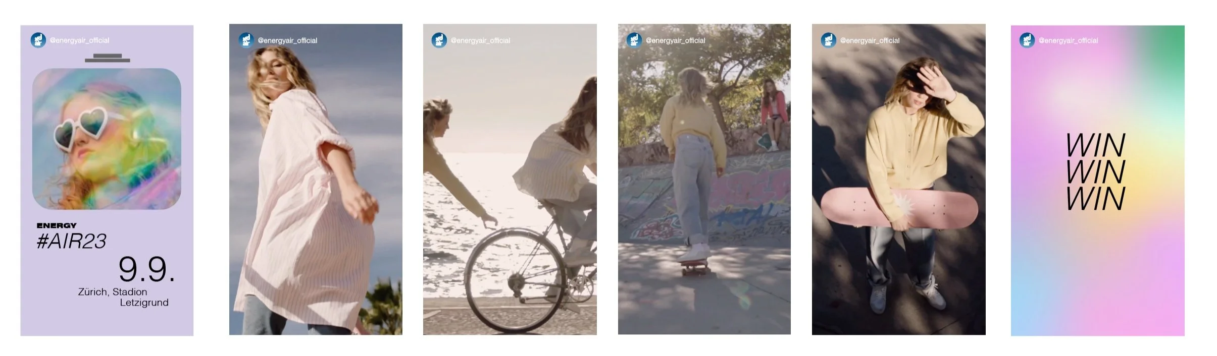
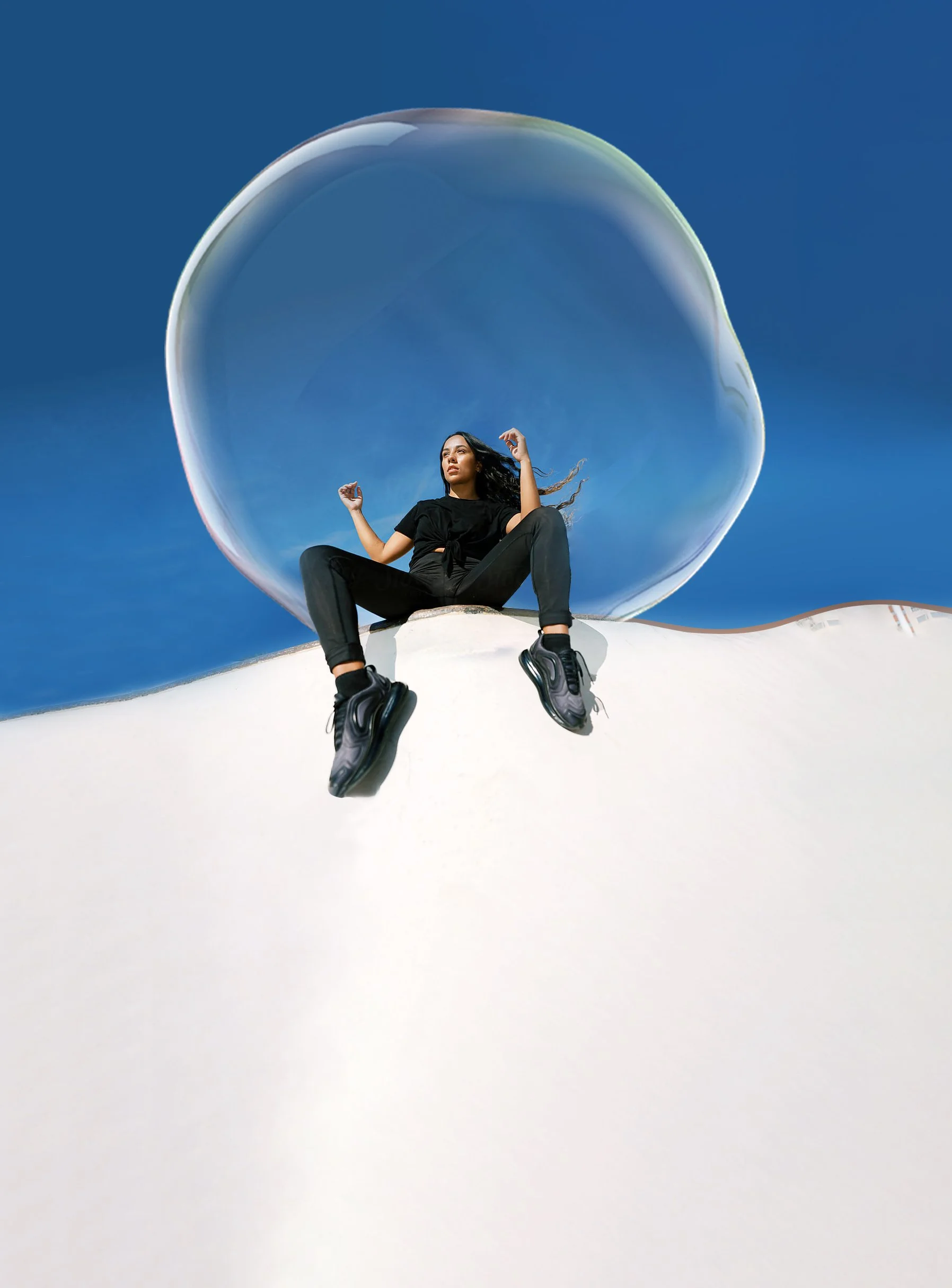
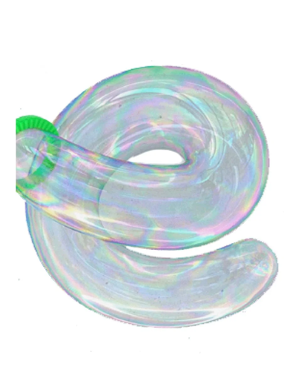
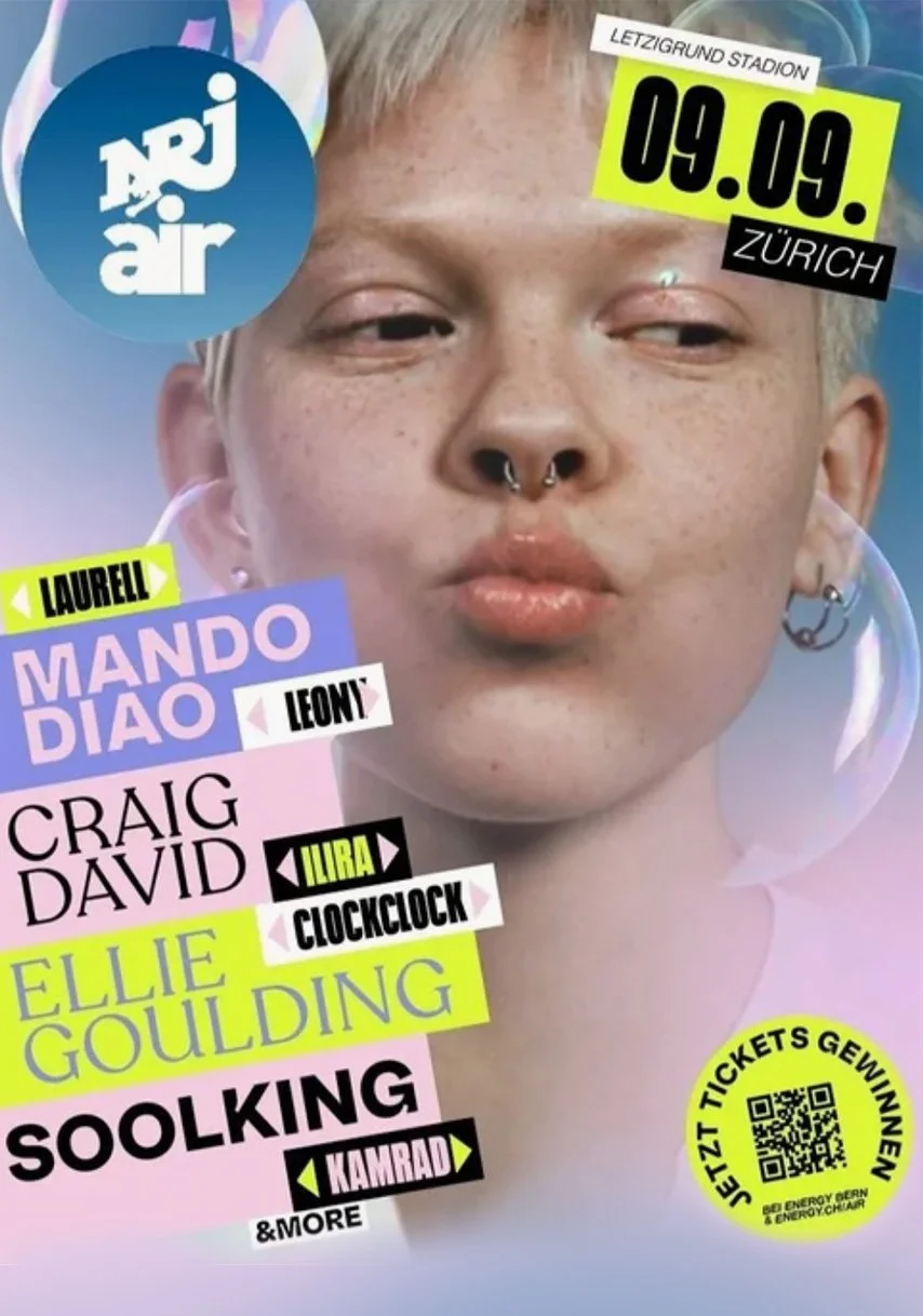
Visual Study: A series of compositional experiments combining found imagery (Pinterest/Google) with AI-generated soap bubbles. The aim was to capture movement and visual lightness through oversized bubbles and dynamic figures. For non-commercial, inspirational use only.

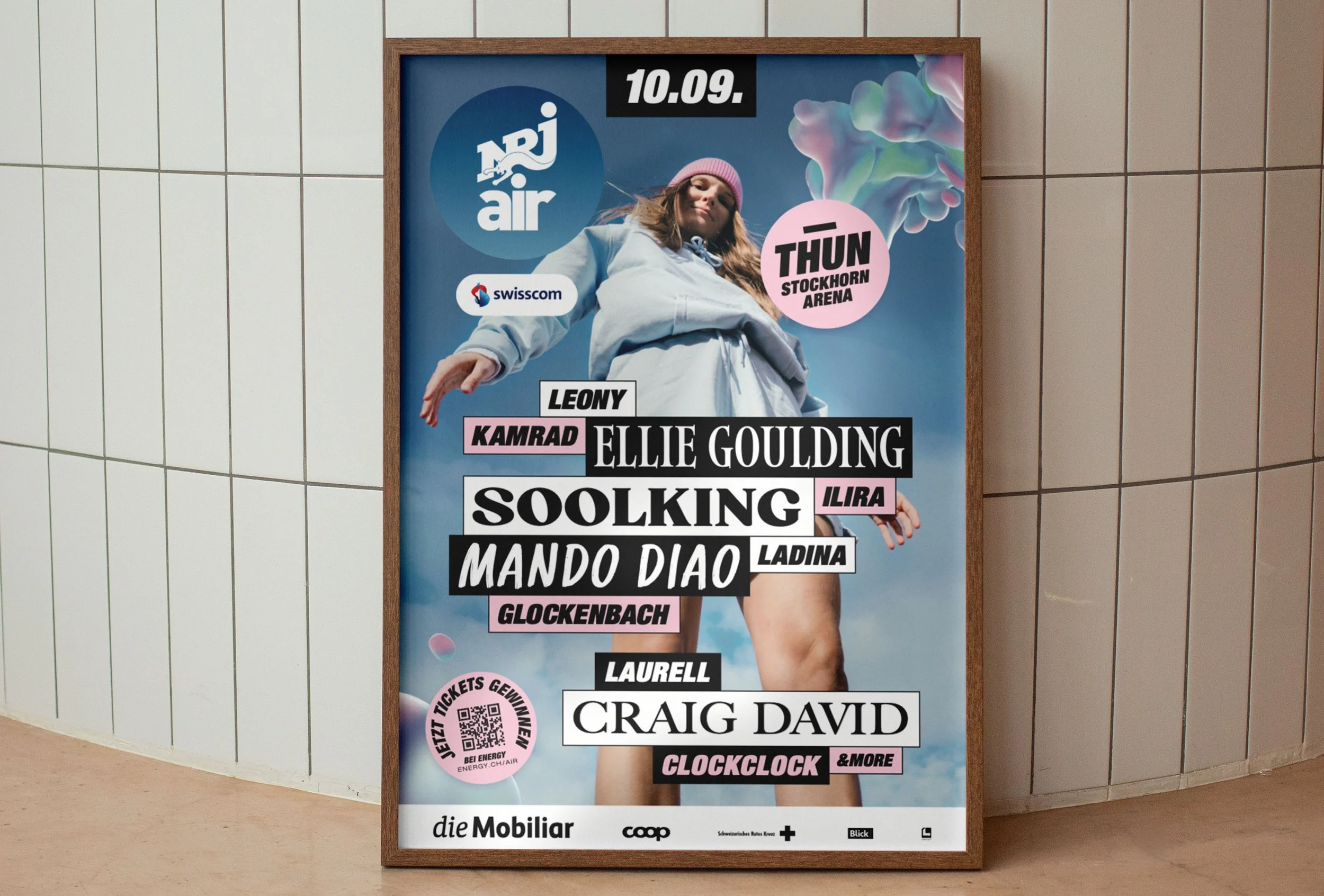
Visual Research: This first phase was all about getting a feel for the right visual language – bold, playful, a little loud. I collected references, explored different directions and looked for artists whose energy matched the project. Images used for inspiration only, non-commercial.

From Mood to Message
A Concept Study in Style & Emotion
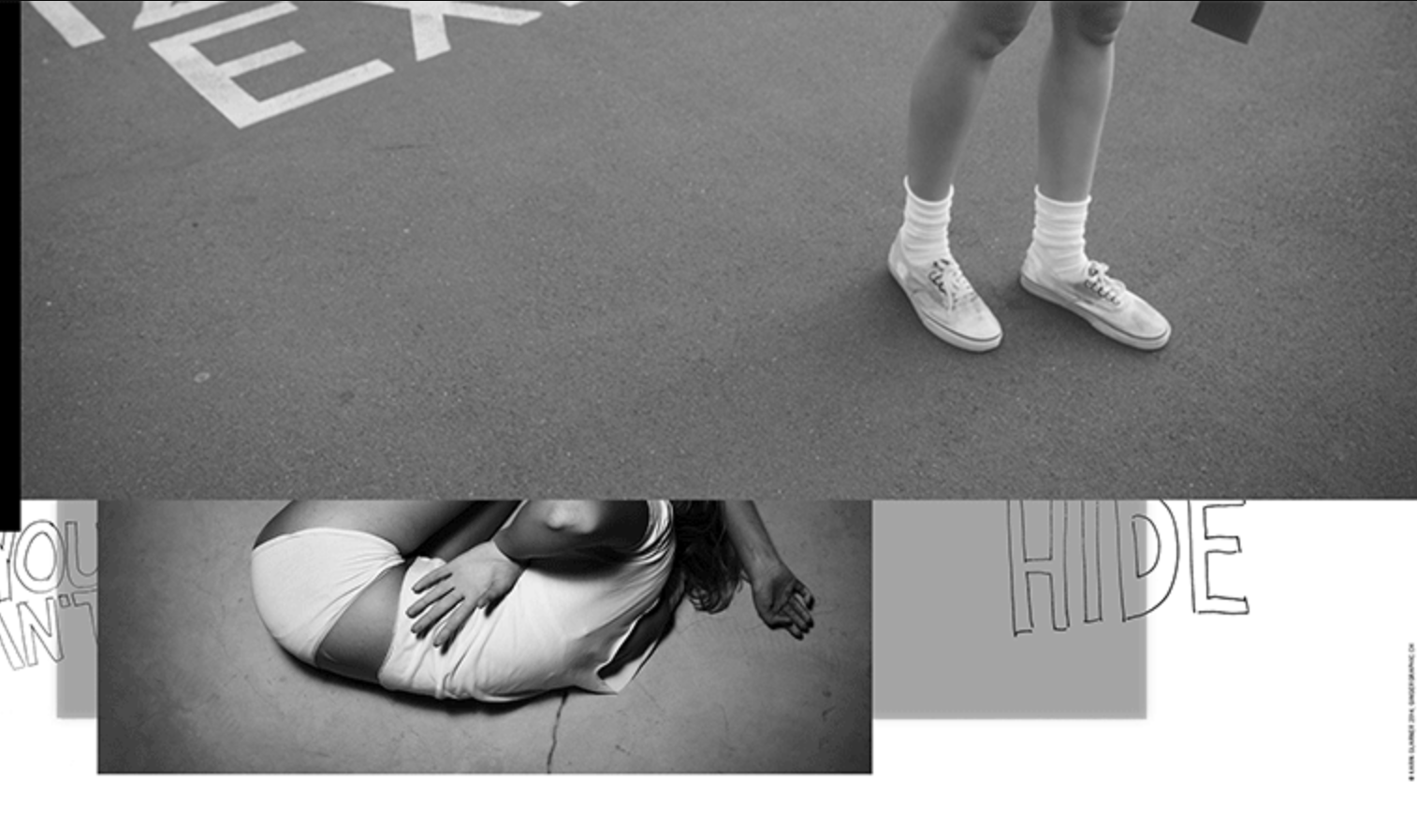
This project came out of an early concept phase – a space to think freely, explore moods, and shape ideas through visual language. It wasn’t about execution yet, but about asking: What kind of world do we want to create? What could it feel like?
I worked with type, textures, and imagery to build a tone that felt bold, soft, and human. Some elements like the T-shirt mockups were created as part of the visual exploration and were not developed further at this stage. The work reflects how I approach creative direction: deeply, emotionally, and with a clear sense of visual storytelling.
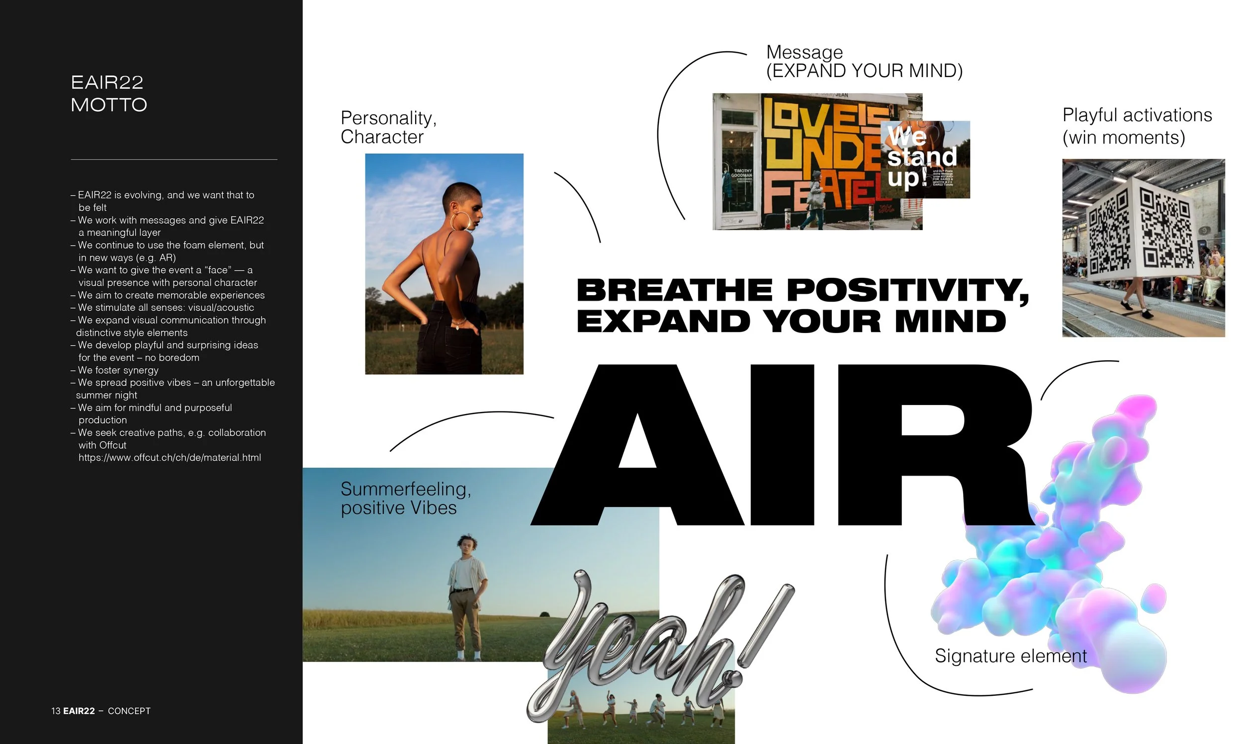
Moodboard & concept keywords – Early explorations of tone, energy and messaging. Editorial visual direction – Expressive, fluid and sunlit – aiming for emotional connection.

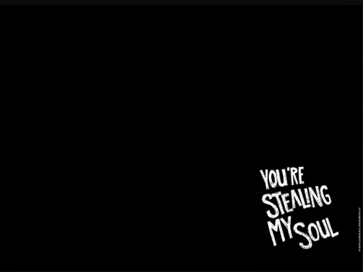
Typo Experiment – A test with chromatic 3D type to define mood and style direction.
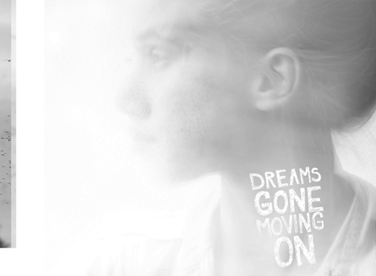
Statement draft – Framing the project purpose and audience connection. into physical formats and community touchpoints.

Merchandise mockups – Designed to test how visual elements could extend into physical formats and community touchpoints.
Visual Exploration – Testing Directions & Mood
Explorative studies developed to test visual tone, content rhythm, and brand expression across digital formats. Each direction reflects a different emotional and stylistic approach.
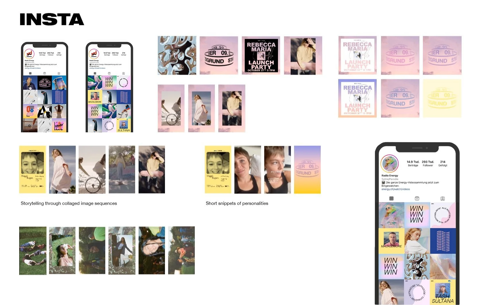
Instagram Grids – Exploring visual rhythm and storytelling pattern
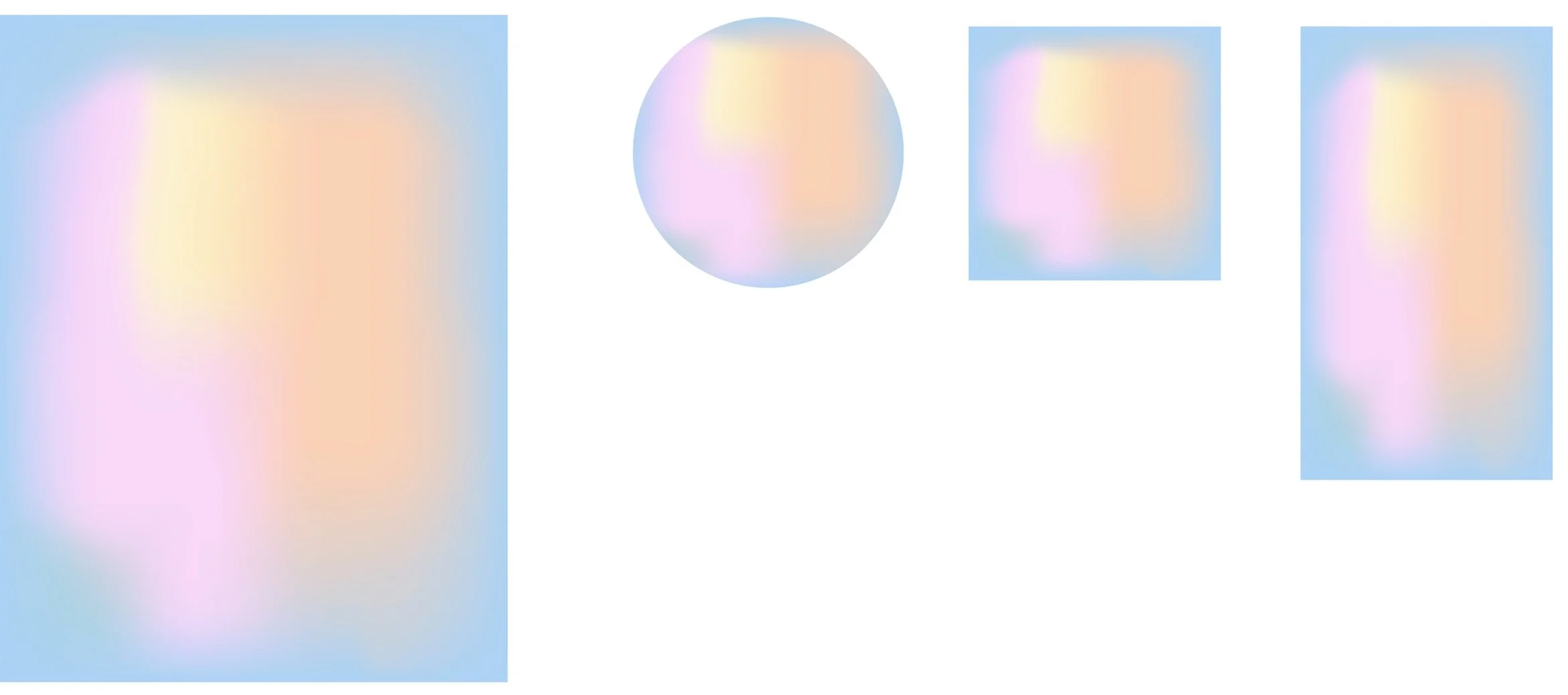

Soft Gradients – Building mood through light and color flow
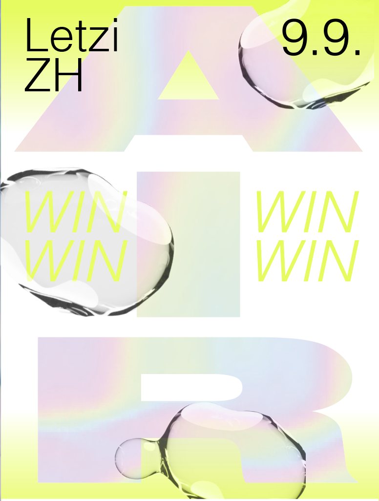
Compositions & Textures – Oversized bubbles and fluid forms in motion
Typography Experiments – Playing with layout, contrast and hierarchy